OUR WORK
Take a look at some of Mike’s favorite design and illustration work that he’s created for a variety of clients ranging from small businesses to major brands, and everywhere in between.
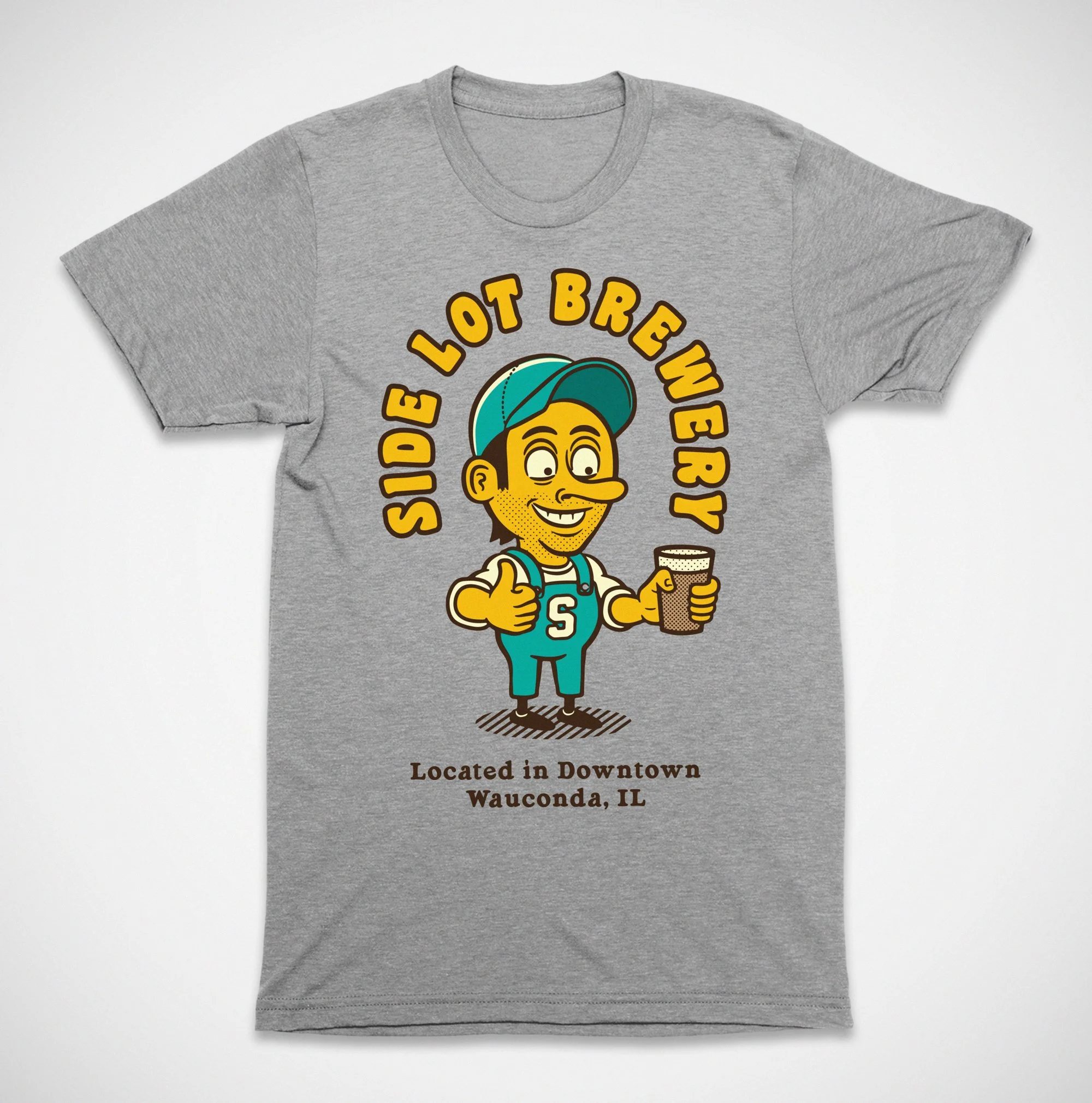
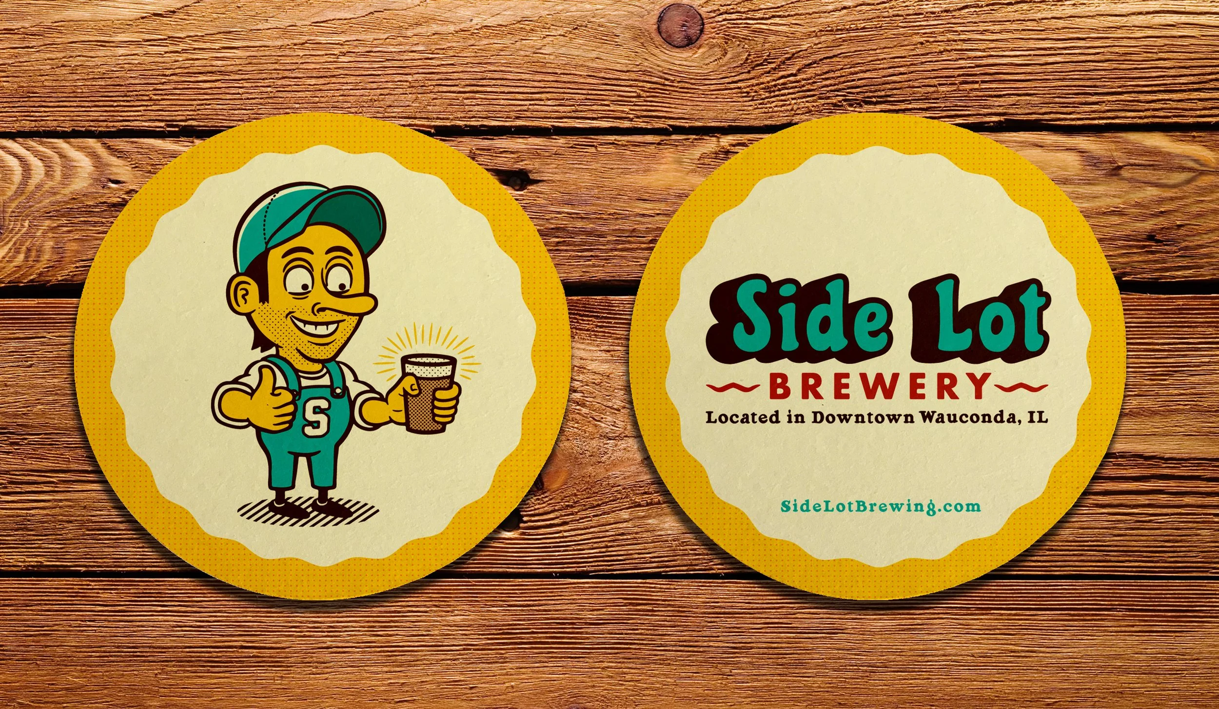
Client: Side Lot Brewery / The Side Lot • Wauconda, IL
Project: Marketing Collateral And Graphic Asset Toolkit
For this project, Mike developed a cohesive set of graphic assets tailored to print and web, creating flexible artwork that translates across a variety of mediums including promotional postcards, posters, coasters, staff and retail apparel, stickers, menu inserts, social media, and digital advertising. The project focused on a unified visual language featuring custom illustrations, a minimal yet striking color palette, and bold typographic treatments, with clever iconography and copywriting that highlight the company’s unique character.
Assets were delivered in production-ready formats with die-lines and color specs to streamline printing, plus layered files for seasonal promos and event-based adaptations. The result strengthened brand recognition amongst the local community and in-house, increased merchandise appeal, and provided the client with a practical toolkit for consistent, on-brand marketing across every touch-point.
** CLICK / TAP A THUMBNAIL TO PULL UP FULL-SCREEN SLIDESHOW **
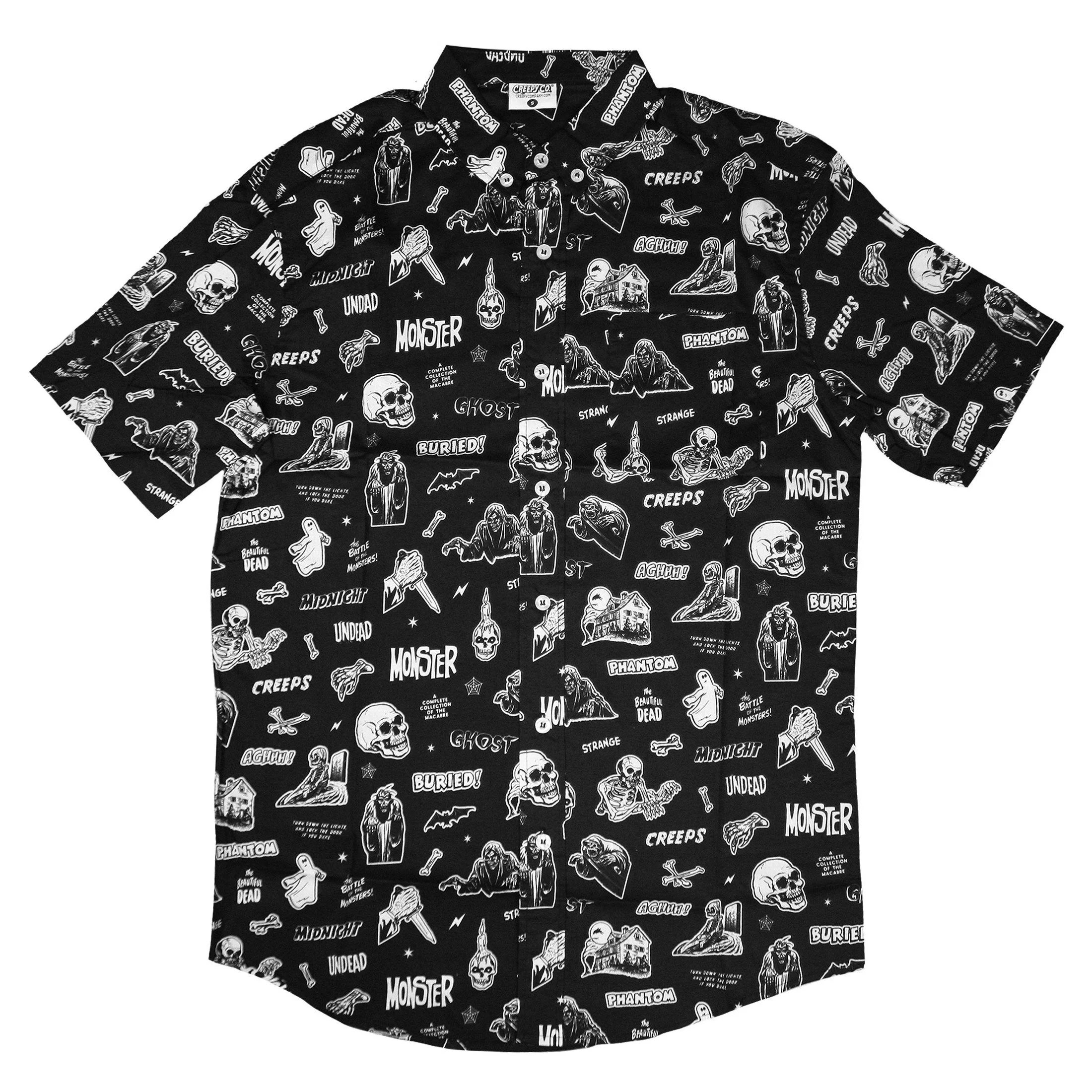
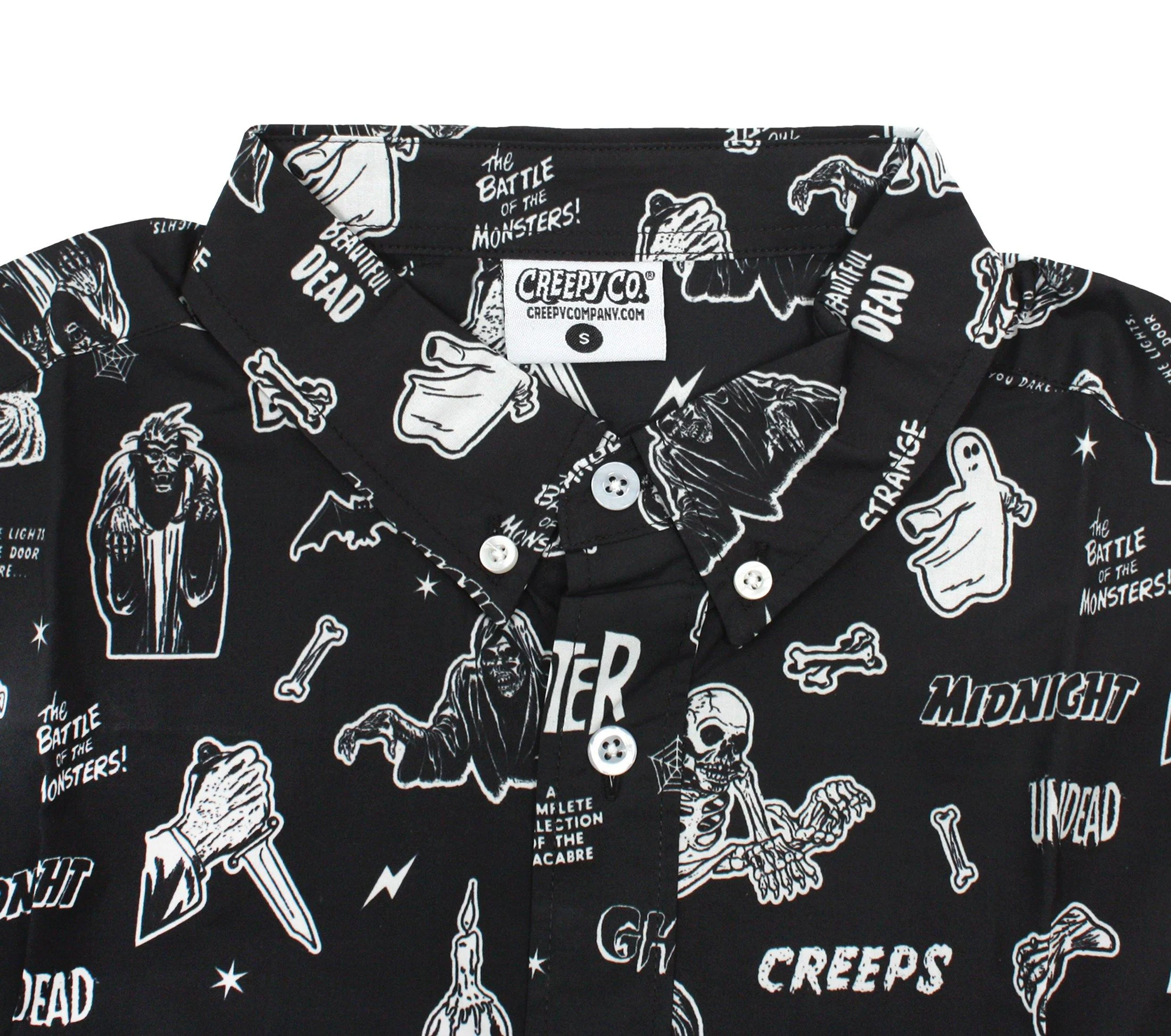
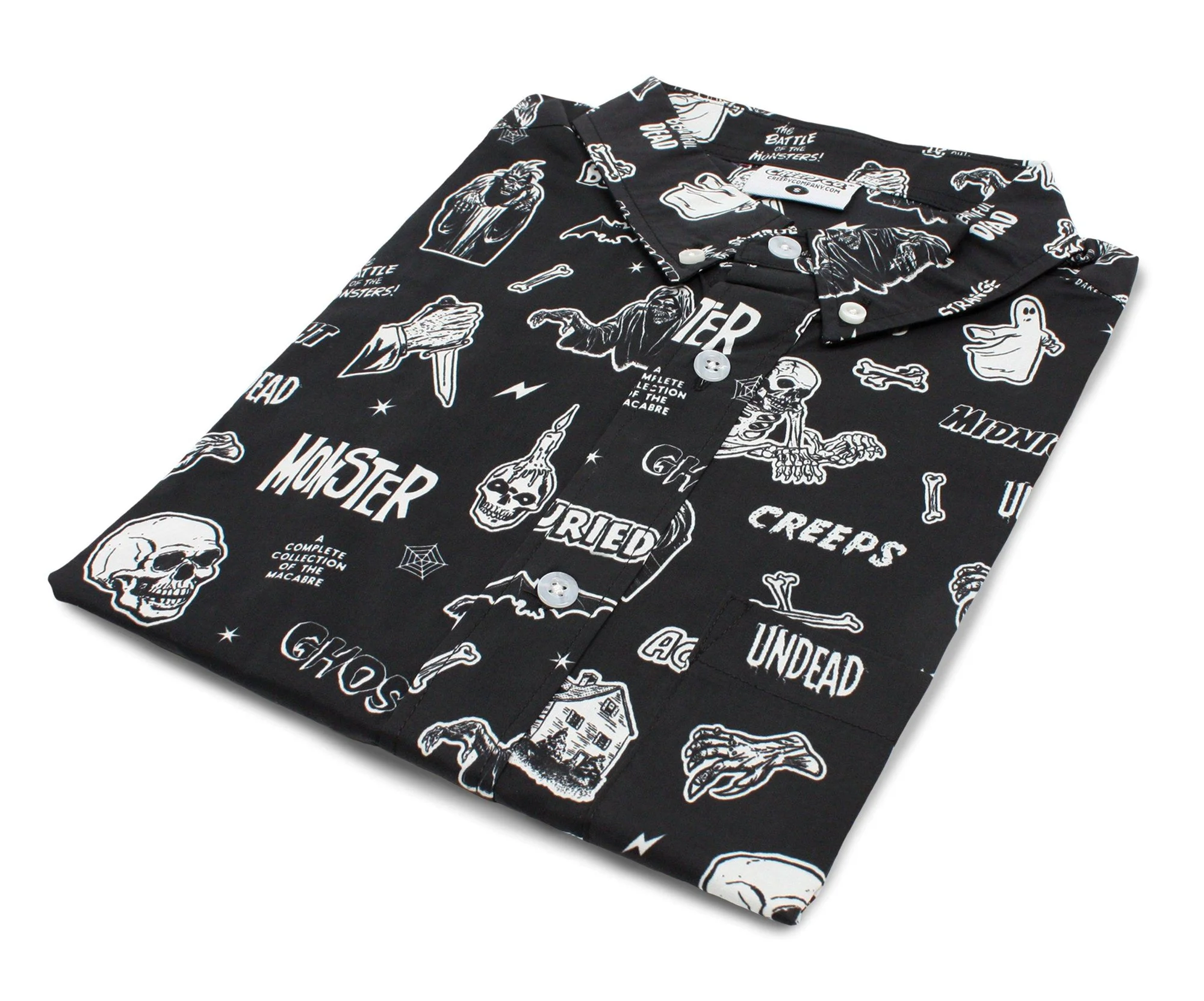
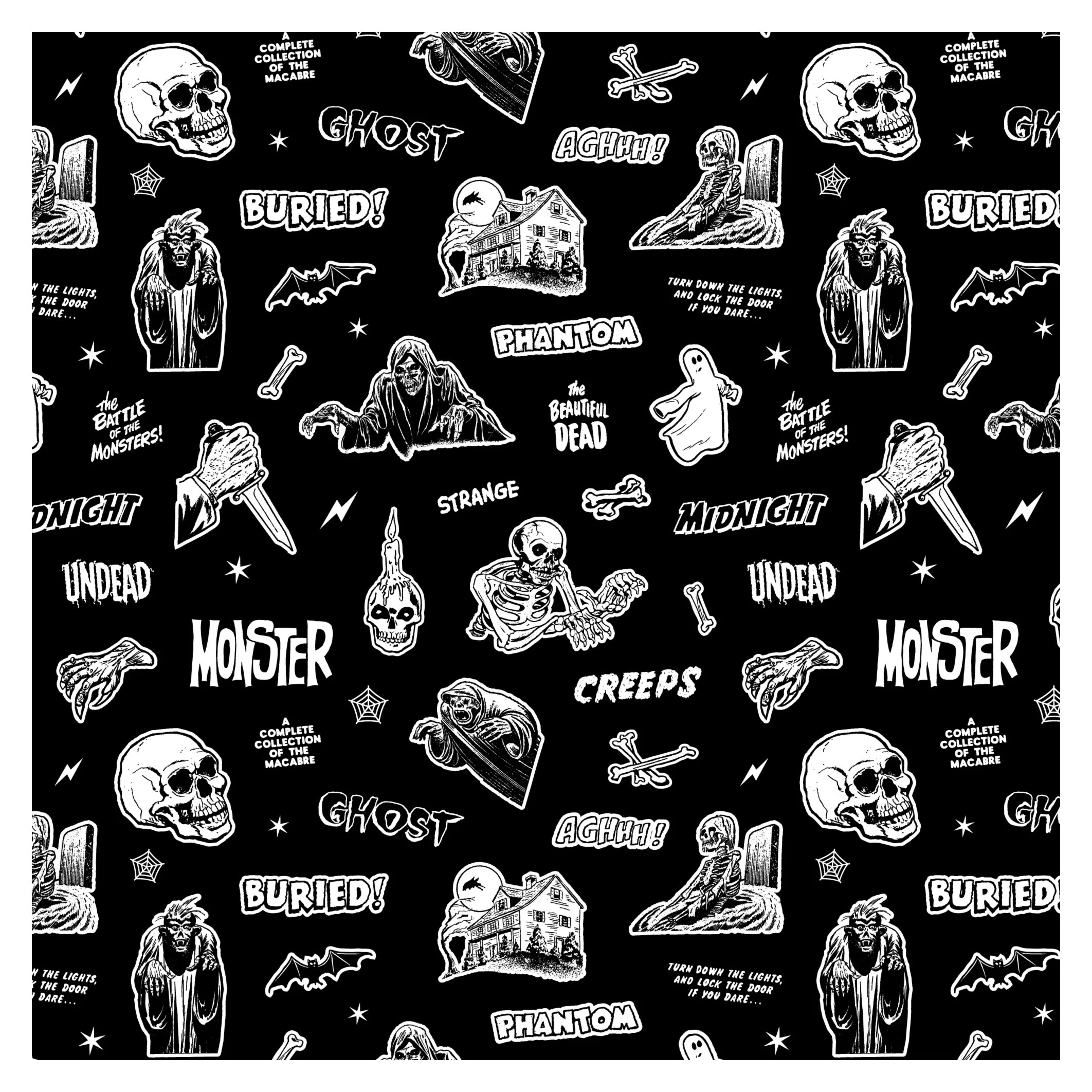
Client: Creepy Co • Chicago, IL
Project: Vintage Horror Comic Seamless Pattern Button-Up Shirt
For this eye-catching apparel project, Mike was commissioned by Chicago’s Creepy Company to design a truly unique vintage horror comic button-up, which was a brief that sent him diving deep into the stacks of public domain pulps and comic ephemera. Over many hours, he combed through an almost endless array of panels, hunting for the right mix of macabre illustrations and period typography, then carefully cleaned-up and vectorized each element.
Those pieces were artfully combined, retouched, and crafted into a seamless repeating pattern that preserved the aesthetic and character of the originals while reading clearly at shirt scale. The final button-up, which strikes a perfect balance of spooky nostalgia and modern style, quickly became Creepy Company’s top-selling button-up, and a standout that reads like a wearable page from a lost horror anthology.
** CLICK / TAP A THUMBNAIL TO PULL UP FULL-SCREEN SLIDESHOW **
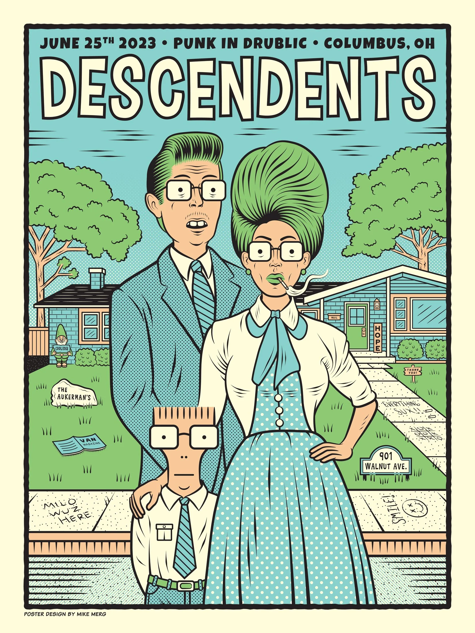
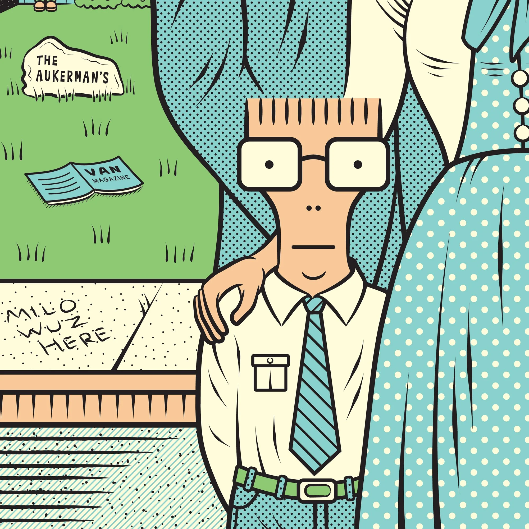
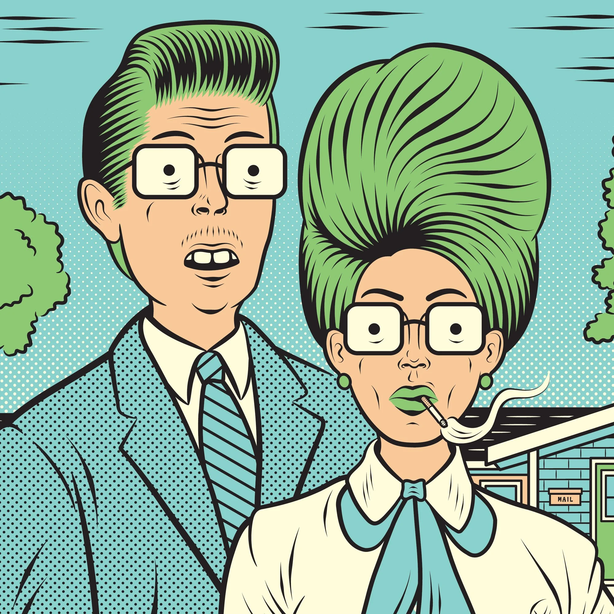
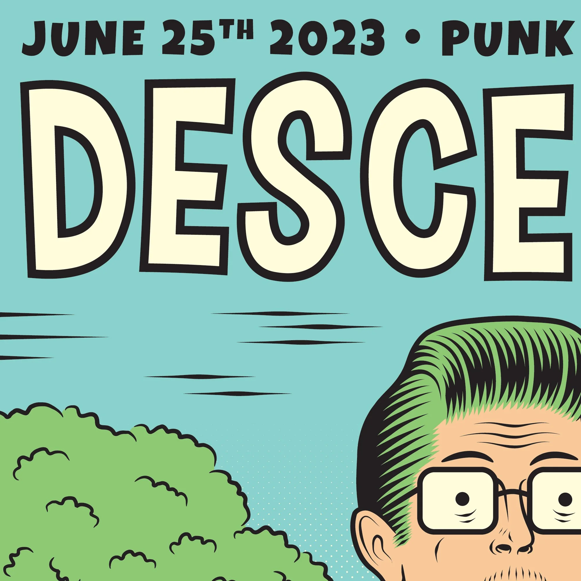
Client: Descendents • Legendary Punk Rock Band From Southern CA
Project: 18x24 Screen printed Gig-Poster For Their 6.25.23 Show In Columbus, OH
Much of Mike’s work involves collaborations with bands, and on this occasion, Mike was honored when he was asked to illustrate and design an 18x24 inch screen-printed concert poster for the legendary punk band Descendents’ June 25th, 2023 show in Columbus, Ohio. At the show a limited edition of 100 prints was sold through the band’s merch-booth alongside a variety of other merchandise. The poster offers a playful take on the band’s mascot “Milo”, riffing on their classic song “Suburban Home” and more specifically the lyric “I wanna be a clone, I want a suburban home.” The design, which also features a number of easter-egg song references mixed into the composition, perfectly captures the band’s humorous personality and sarcastic nature.
Upon its online reveal, the poster was an instant hit with fans, quickly selling out at the show and again when a second allotment was released online. This was Mike’s first poster for Descendents, and its warm reception from both the band and their audience has resulted in continuing collaborations on many subsequent concert posters. From concept and illustration through final color separations, Mike handled every aspect with extreme care to ensure that the printer could easily produce a flawless end product for the band.
** CLICK / TAP A THUMBNAIL TO PULL UP FULL-SCREEN SLIDESHOW **
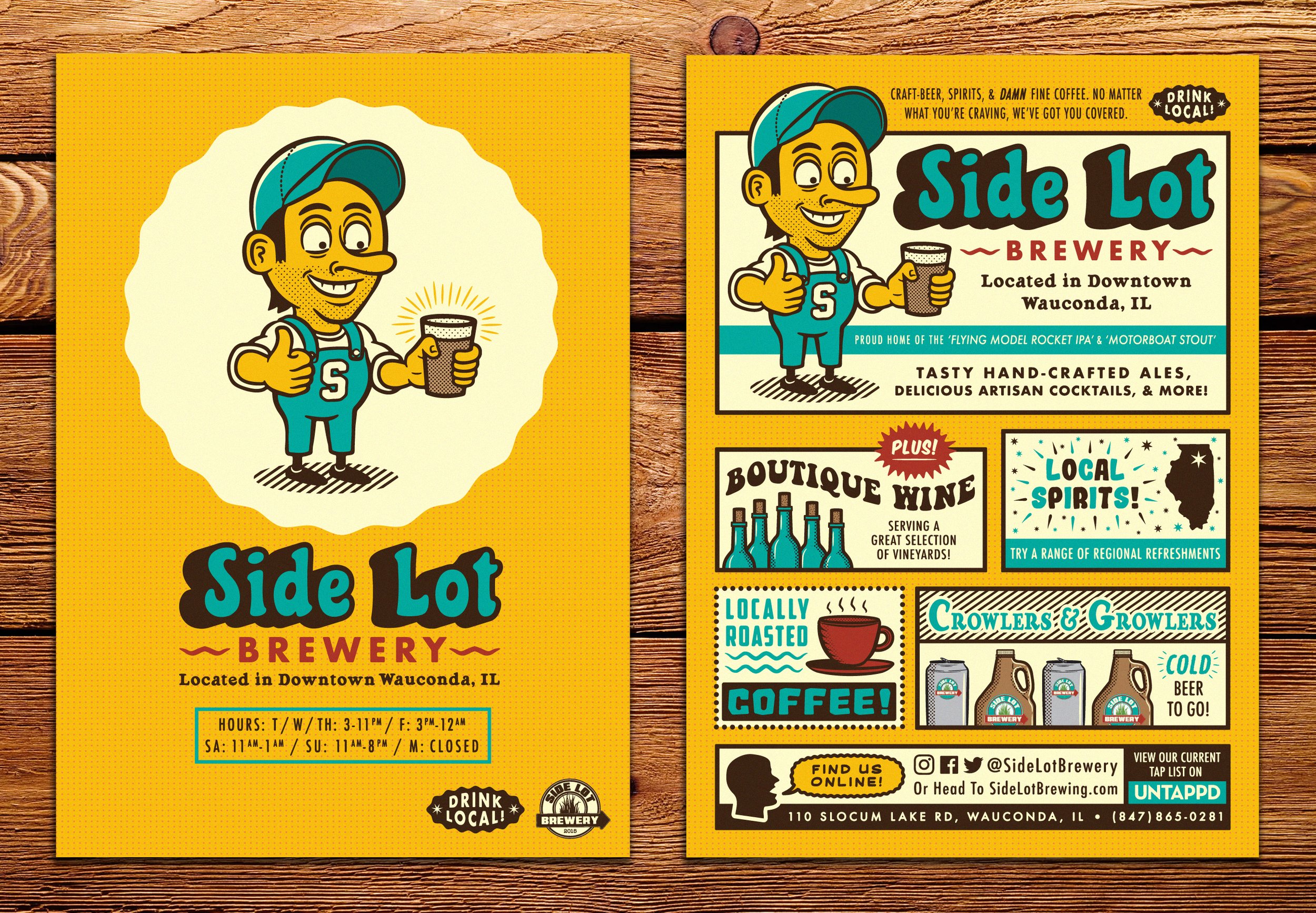
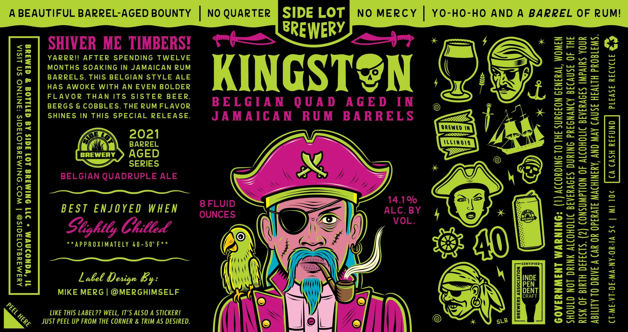
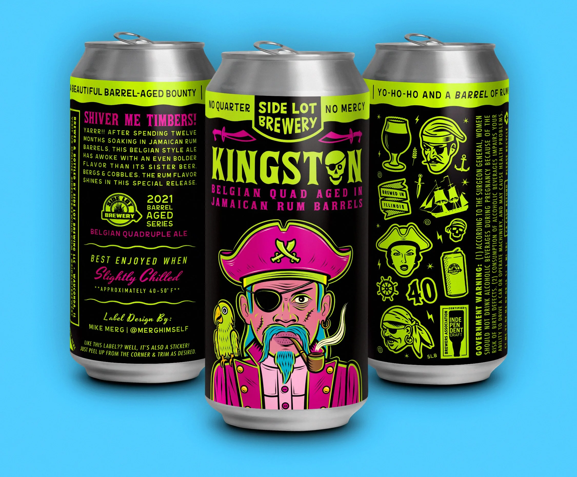
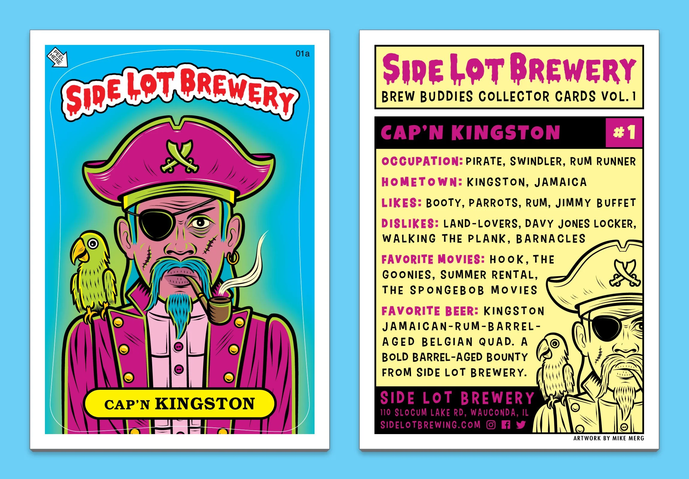
Client: Side Lot Brewery / The Side Lot • Wauconda, IL
Project: Label / Packaging Design For Side Lot Brewery’s Kingston Belgian Quad
Dead men tell no tales, but this label speaks for itself. For this project, Mike once again teamed up with Side Lot Brewery to bring the Kingston Belgian Quadruple Ale to life. Inspired by pirate lore and the notorious haunts of the Caribbean, the label centers around an eccentric pirate character, and leans into pirate culture and lingo for the supporting graphic elements, and copywriting which was also all written by Mike. Striking saturated colors stand out against a dark black background, delivering a stunning visual effect. From the finely groomed typography, to the artfully crafted illustrations, Mike created a cohesive, premium look that captures the dangerous allure of the high seas while ensuring the packaging stands out on a crowded shelf.
Upon completion, Mike provided Side Lot with a comprehensive launch package, starting with print-ready files containing technical die lines and appropriate bleeds. To round out the campaign, Mike also designed an extremely fun Garbage Pail Kids inspired sticker / collectible card, and a variety of social-ready assets, including realistic can mock-ups. This ready-to-go approach ensured the packaging and marketing materials remained seamlessly integrated throughout the entire release.
** CLICK / TAP A THUMBNAIL TO PULL UP FULL-SCREEN SLIDESHOW **
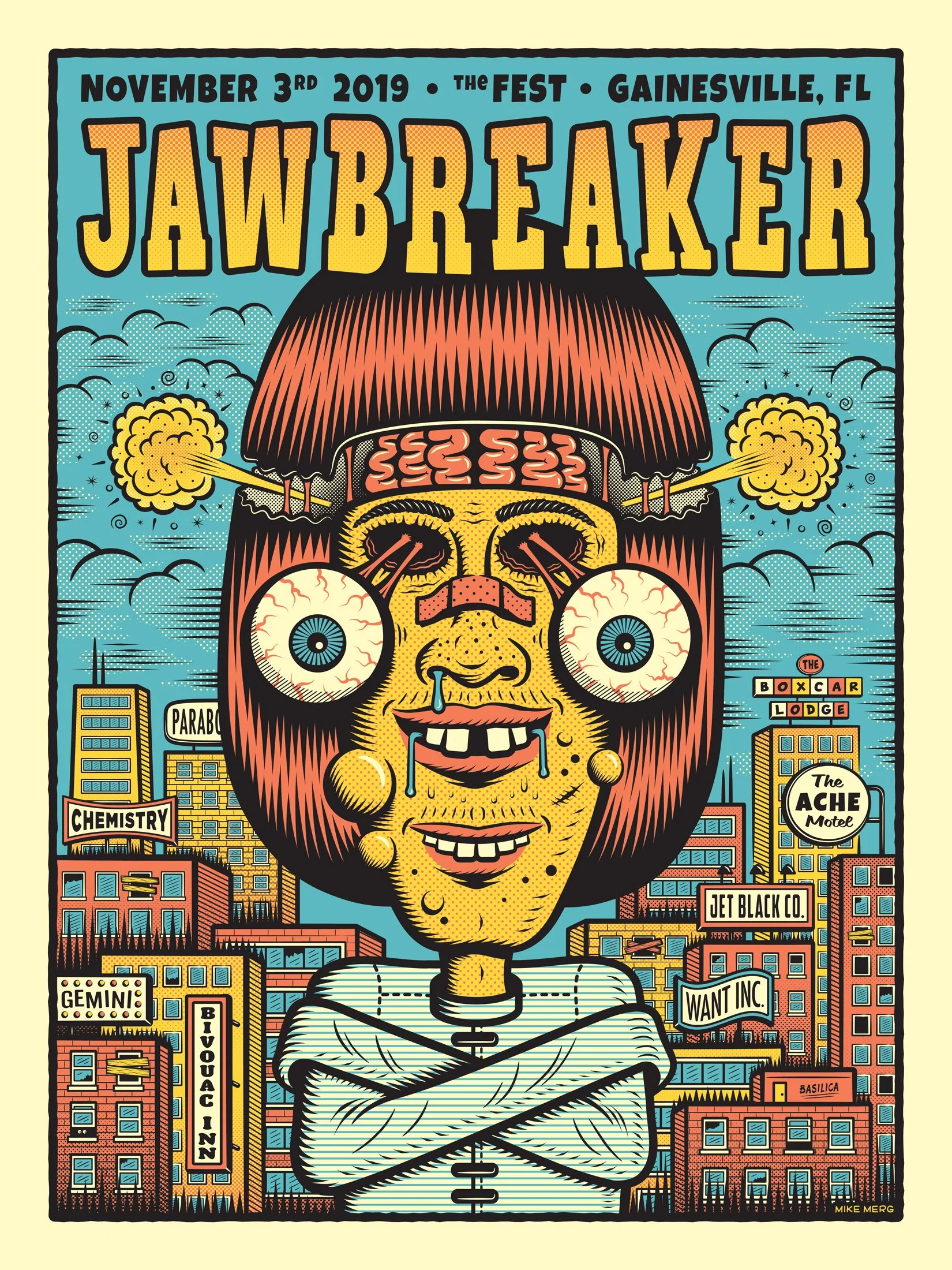
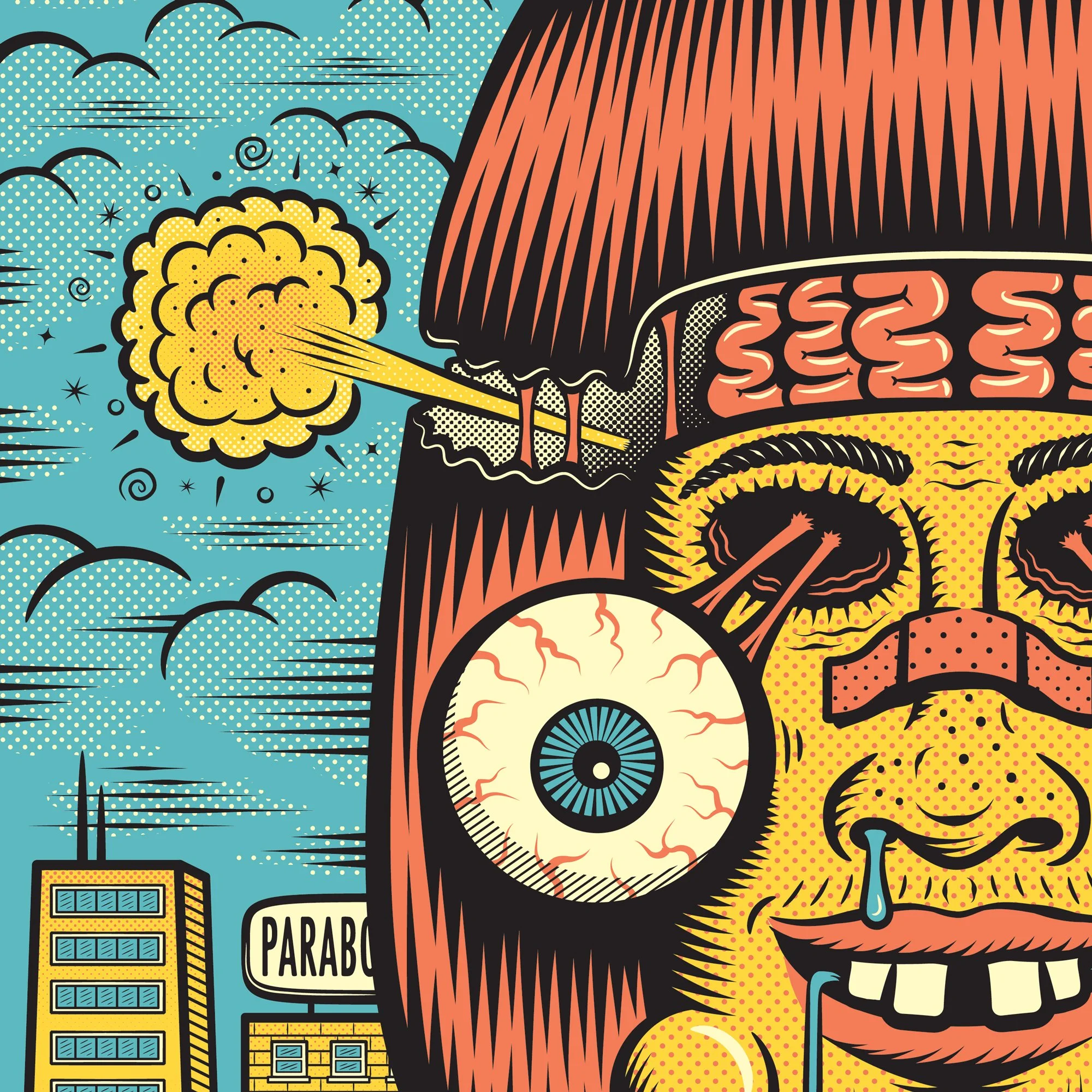
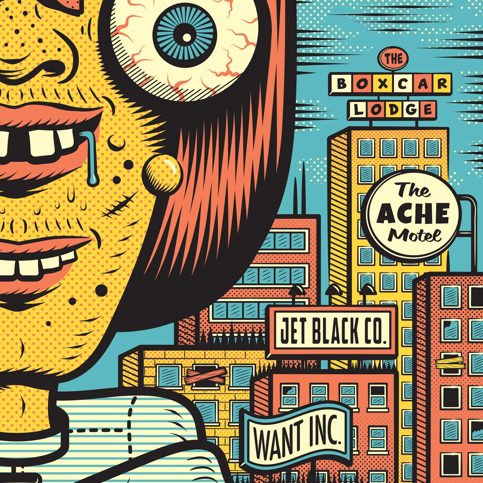
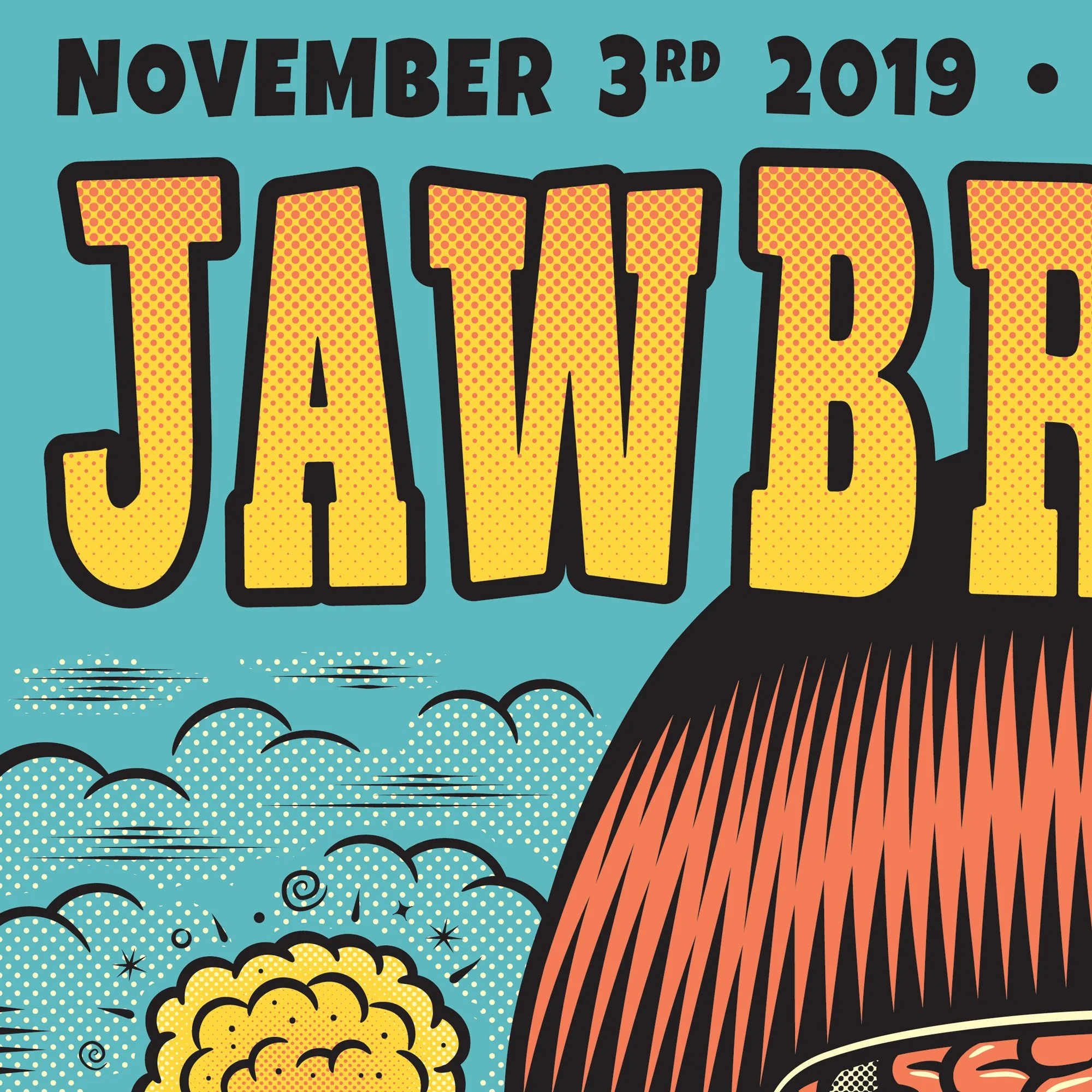
Client: Jawbreaker • Highly Influential Punk Rock Band From Los Angeles, CA
Project: 18x24 Screen printed Gig-Poster For Their 11.3.19 Show In Gainesville, FL
When the opportunity came up to design a concert poster for one of the major pioneers of 1990s punk rock like Jawbreaker, Mike was absolutely stoked to take on the project. For the design, Mike leaned into the band’s punk rock personality while answering a creative brief that called for a wild, irreverent illustration in the vein of cartoonists Basil Wolverton and Robert Crumb. The result was a surreal character set against a dense cityscape of towering skyscrapers adorned with a wide variety of signage featuring Jawbreaker song title references and comic book inspired typography. A vivid, eye-catching color palette ties it all together and gives the poster immediate visual impact.
Upon final artwork approval, Mike produced a meticulously proofed color-separation file for the screen-printer to ensure straightforward production and faithful color reproduction. The poster proved to be a runaway success with fans, quickly selling out at the show and again when a second edition was released online.
** CLICK / TAP A THUMBNAIL TO PULL UP FULL-SCREEN SLIDESHOW **
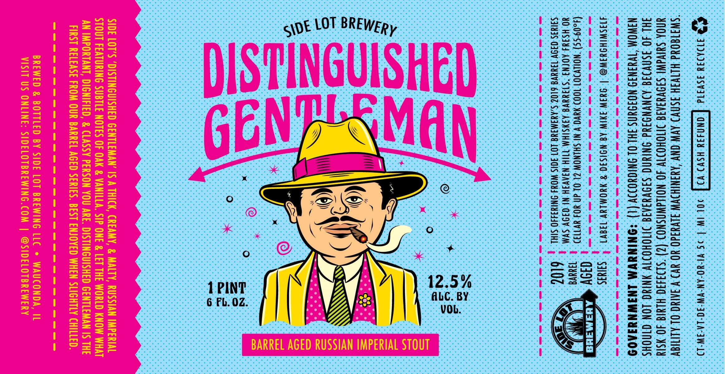
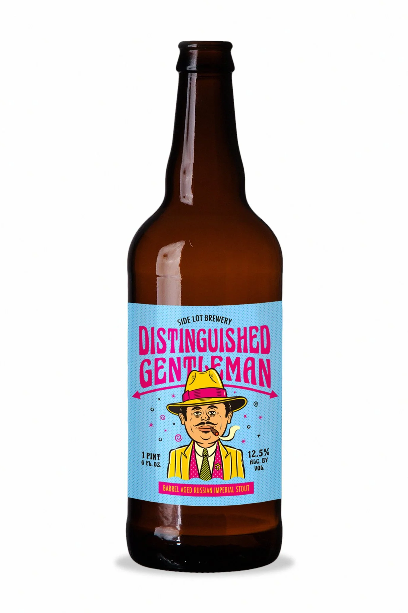
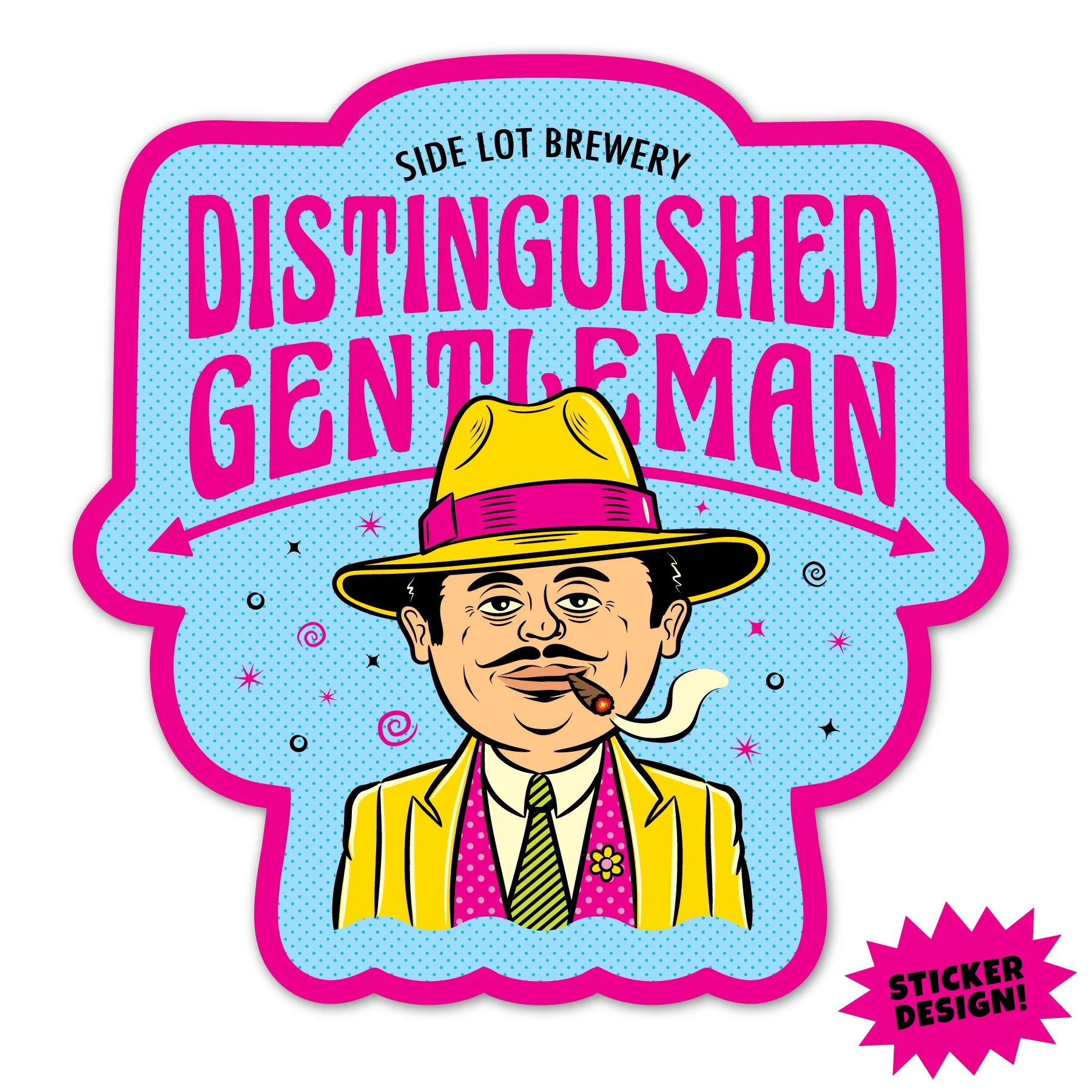
Client: Side Lot Brewery / The Side Lot • Wauconda, IL
Project: Label / Packaging Design For Side Lot Brewery’s Distinguished Gentleman Stout
For Side Lot Brewery’s Russian Imperial Stout, Distinguished Gentleman, Mike built the label around an exaggerated 1930s gangster inspired character illustration with the slicked-back charm of a Dick Tracy villain as a tongue-in-cheek riff on the beer’s name. The character set the tone for the rest of the design which features an Art Deco–inspired type treatment for the branding that reinforced the “distinguished” concept while a vibrant, unexpected color palette amplified the playful edge and tied back to the client’s existing brand.
The finished artwork was delivered print-ready with die lines and appropriate bleeds. Mike also produced a coordinating sticker plus a suite of web-friendly assets, including bottle mock-ups and social graphics, so Side Lot could launch the beer with cohesive packaging and promotional materials.
** CLICK / TAP A THUMBNAIL TO PULL UP FULL-SCREEN SLIDESHOW **
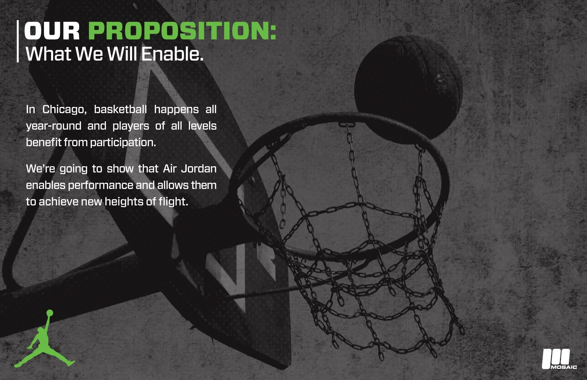
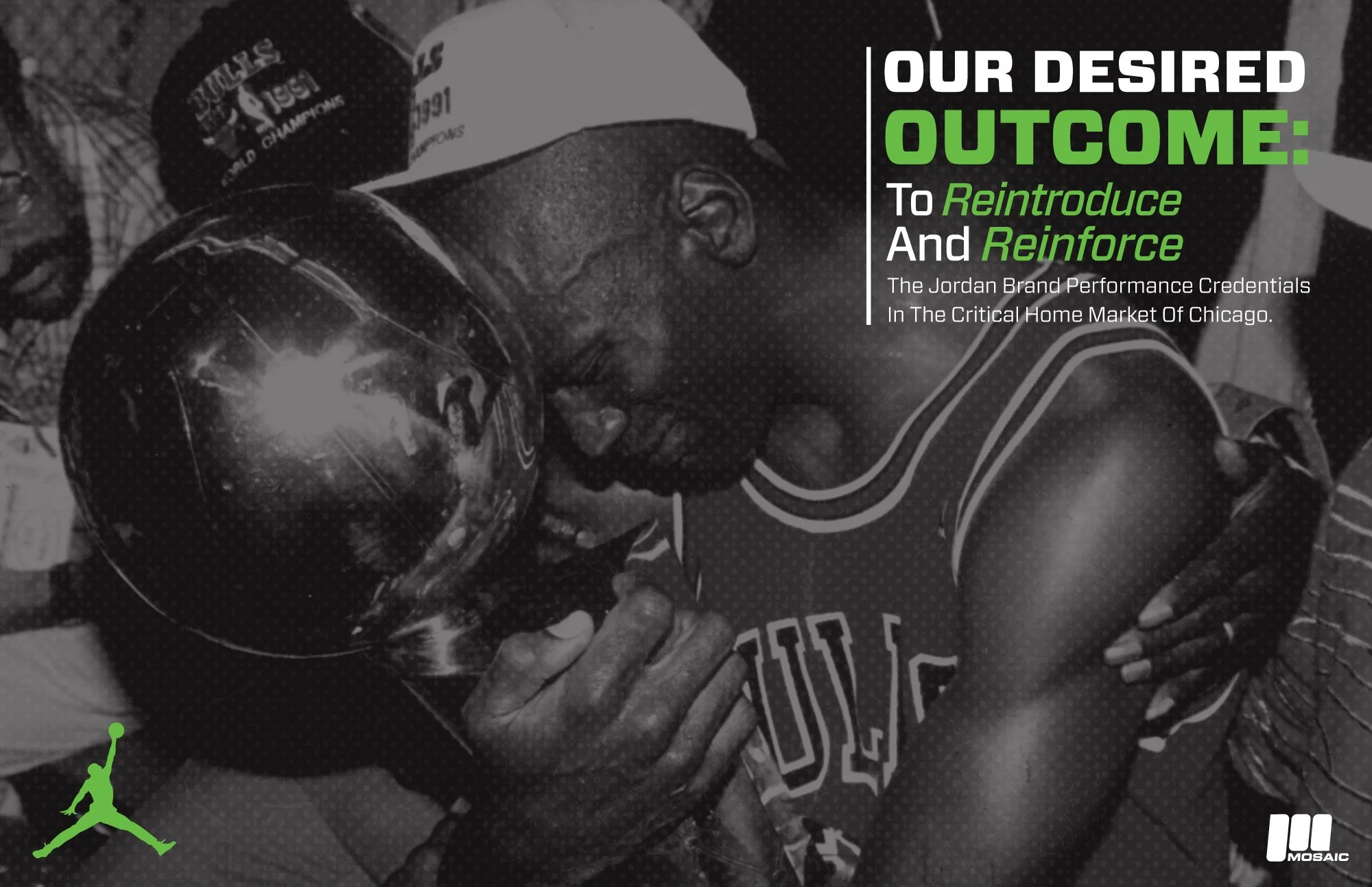
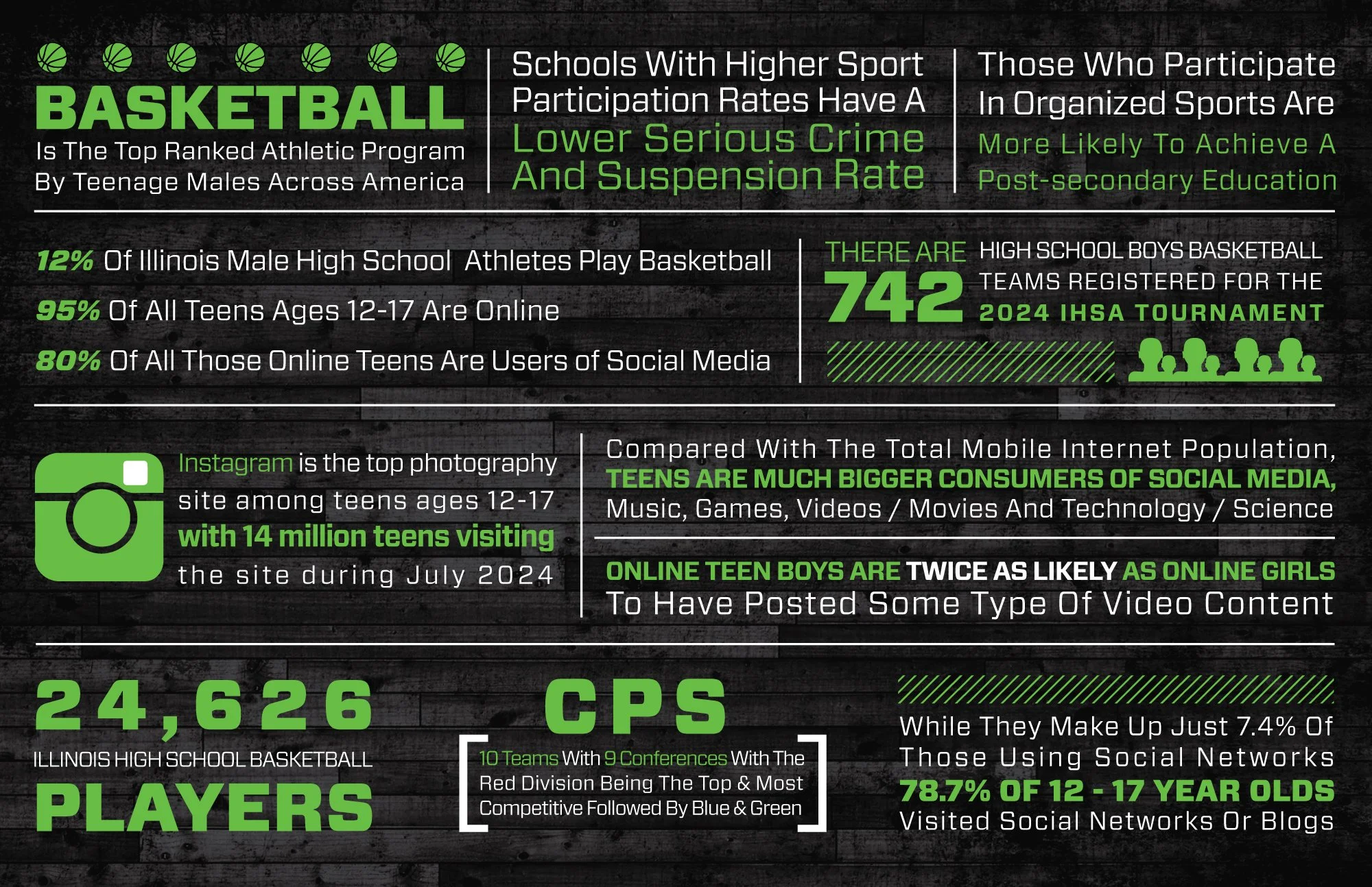
Client: Nike / Jordan Brand For Mosaic Experiential Marketing • Chicago, IL
Project: Experiential Marketing Campaign
For this project, Mike worked with Mosaic Experiential Marketing in Chicago, IL on their campaign for Nike’s Jordan Brand. Mike served a number of roles on this assignment, helping to shape the campaign, and achieve the goal of weaving the brand into the cultural fabric of Chicago’s youth demographics through a series of high-impact, street-level experiential activations and social media outreach.
Mike worked side by side with Mosaic’s creative team, toggling between high-level event ideation and sharp copywriting. Also, as the Graphic Design Lead for the campaign pitch deck, Mike was responsible for translating the team’s ideas into a cohesive and captivating visual narrative. Mike designed a variety of different slides ranging from minimal typographic treatments, to impactful info-graphics and activation renderings. Several examples can be found below. The campaign pitch presentation was a great success and a proverbial Slam Dunk, serving as a key element in helping Mosaic land the client.
** CLICK / TAP A THUMBNAIL TO PULL UP FULL-SCREEN SLIDESHOW **
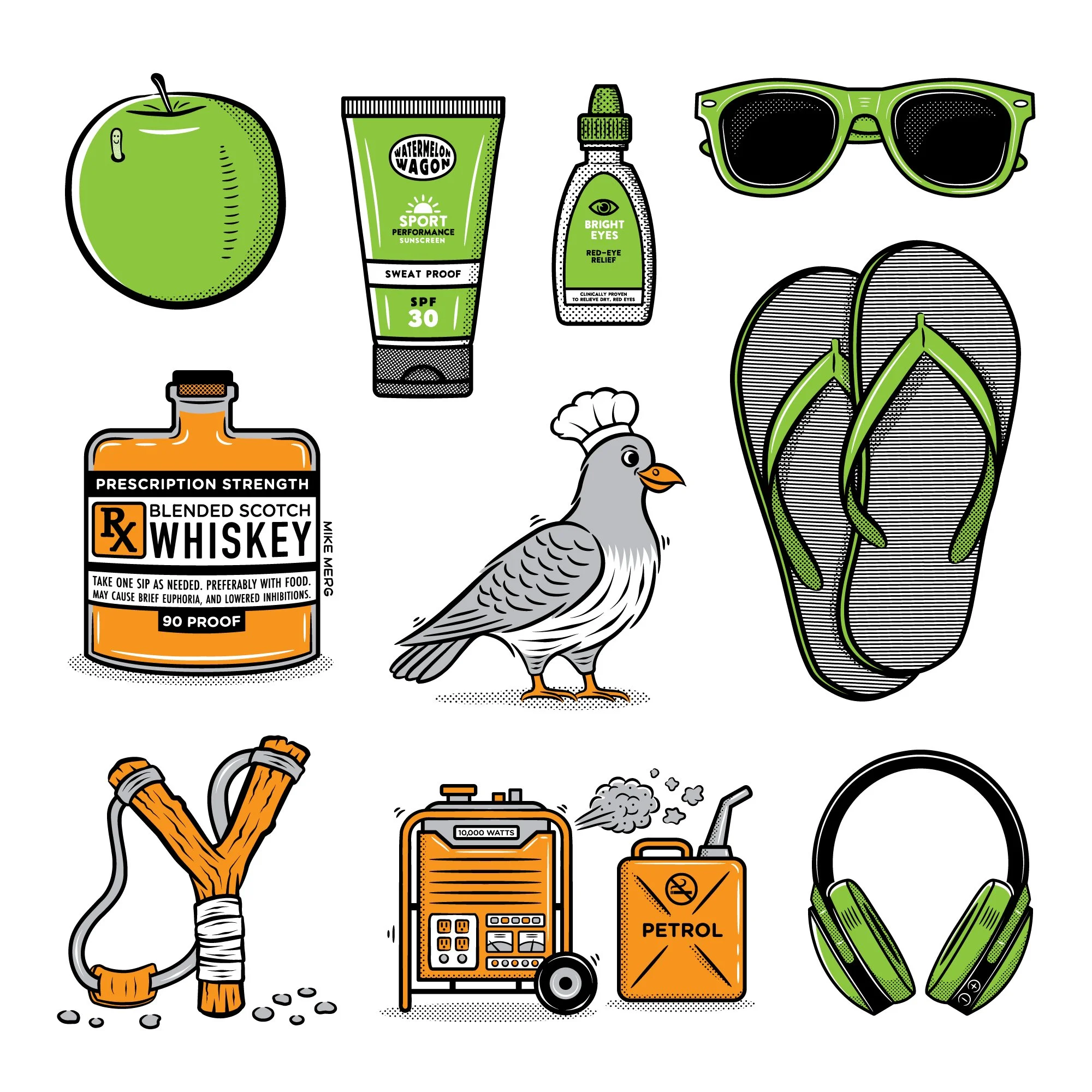
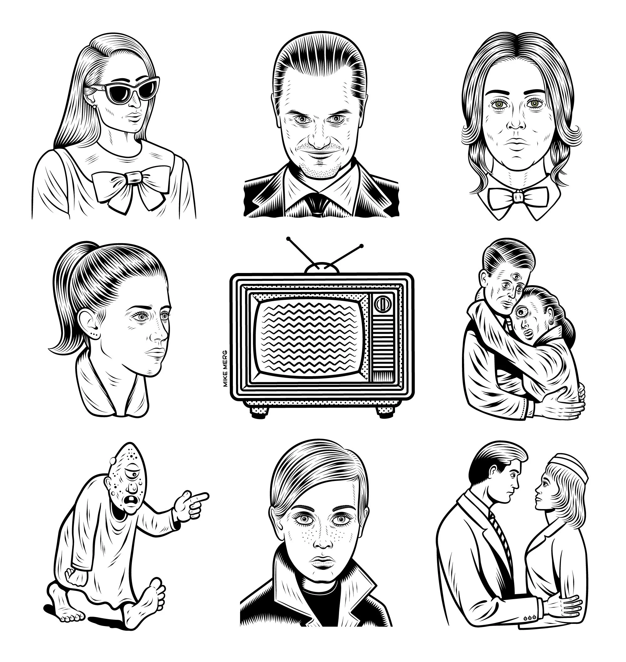
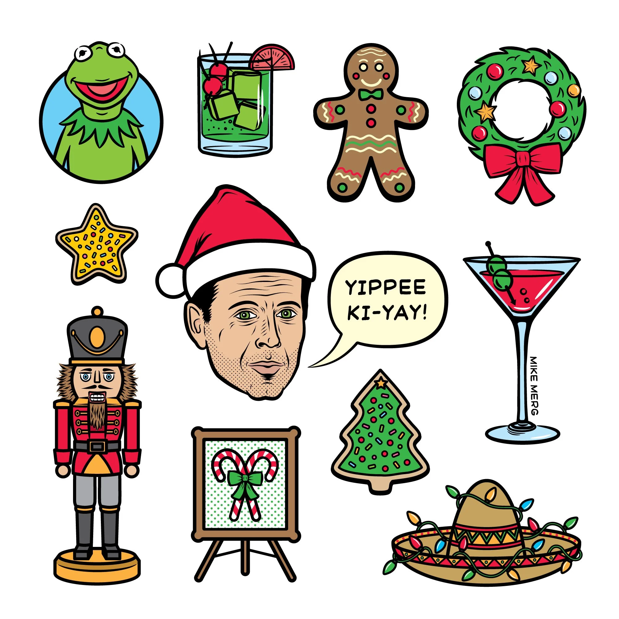
Client: Various
Project: Spot Illustrations
Beyond large-scale branding, Mike has developed an extensive library of spot illustrations through his work for a diverse roster of editorial and commercial partners. This includes character-driven work for clients like Fat Rosie's Mexican Restaurants and Side Lot Brewery, alongside narrative visuals for alternative weekly newspapers such as The Stranger (Seattle), The Portland Mercury, and Isthmus (Madison). These clean, eye-catching illustrations are built for versatility, offering a polished visual language that adapts seamlessly to packaging, editorial layouts, digital marketing, and nearly any application requiring high-impact imagery. Seen below are a few collections of these illustrations that Mike has done for both clients, and as personal stylistic explorations.
** CLICK / TAP A THUMBNAIL TO PULL UP FULL-SCREEN SLIDESHOW **
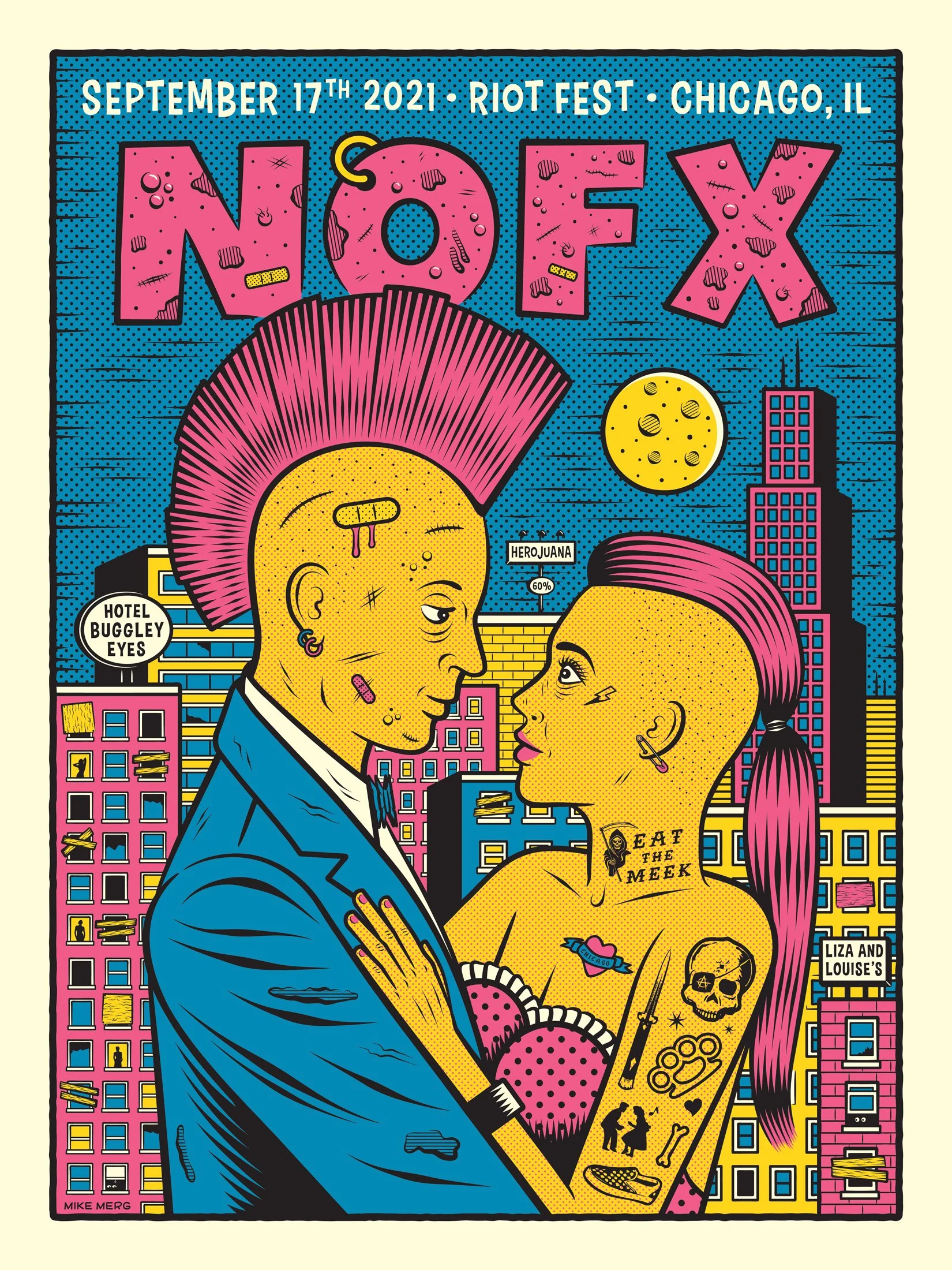
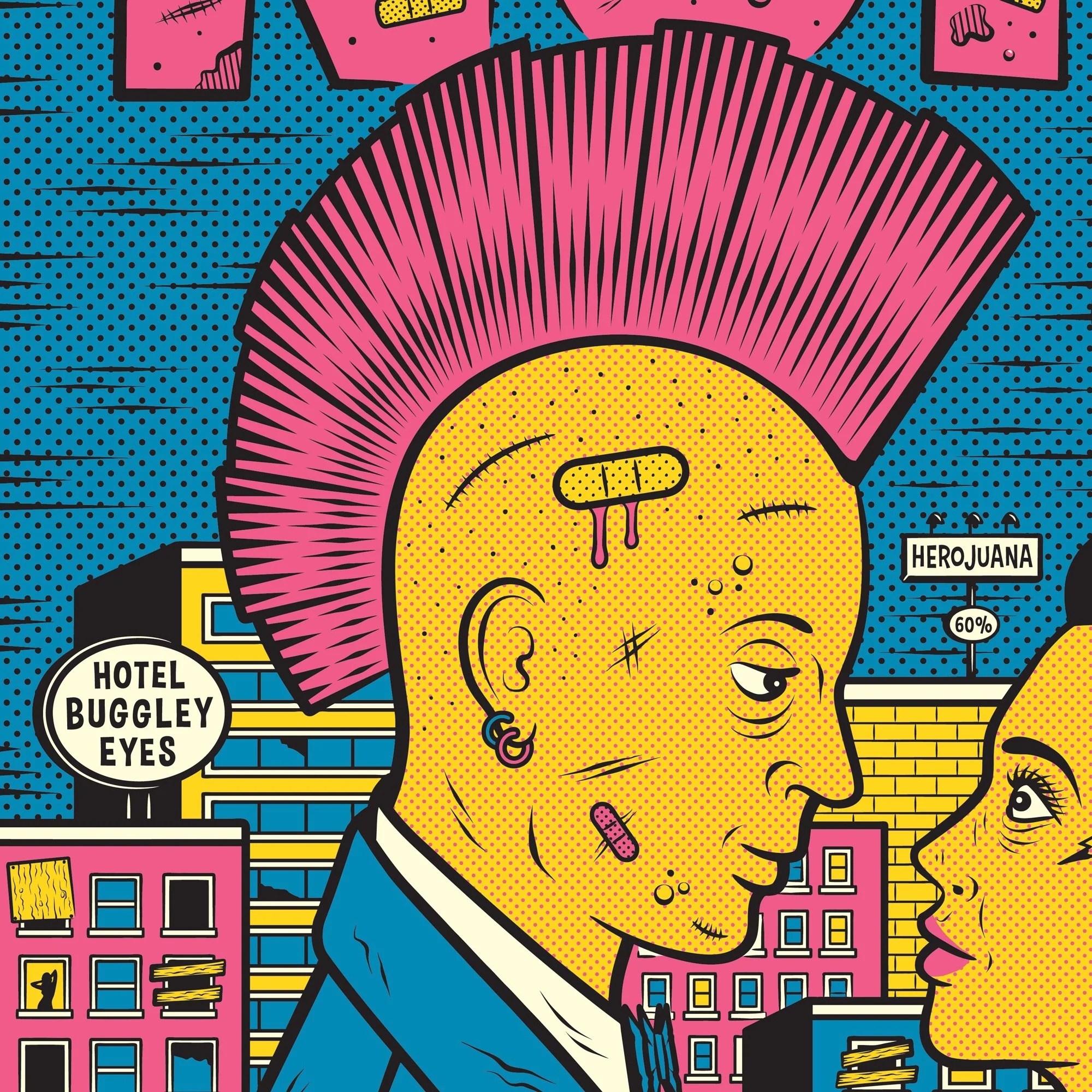
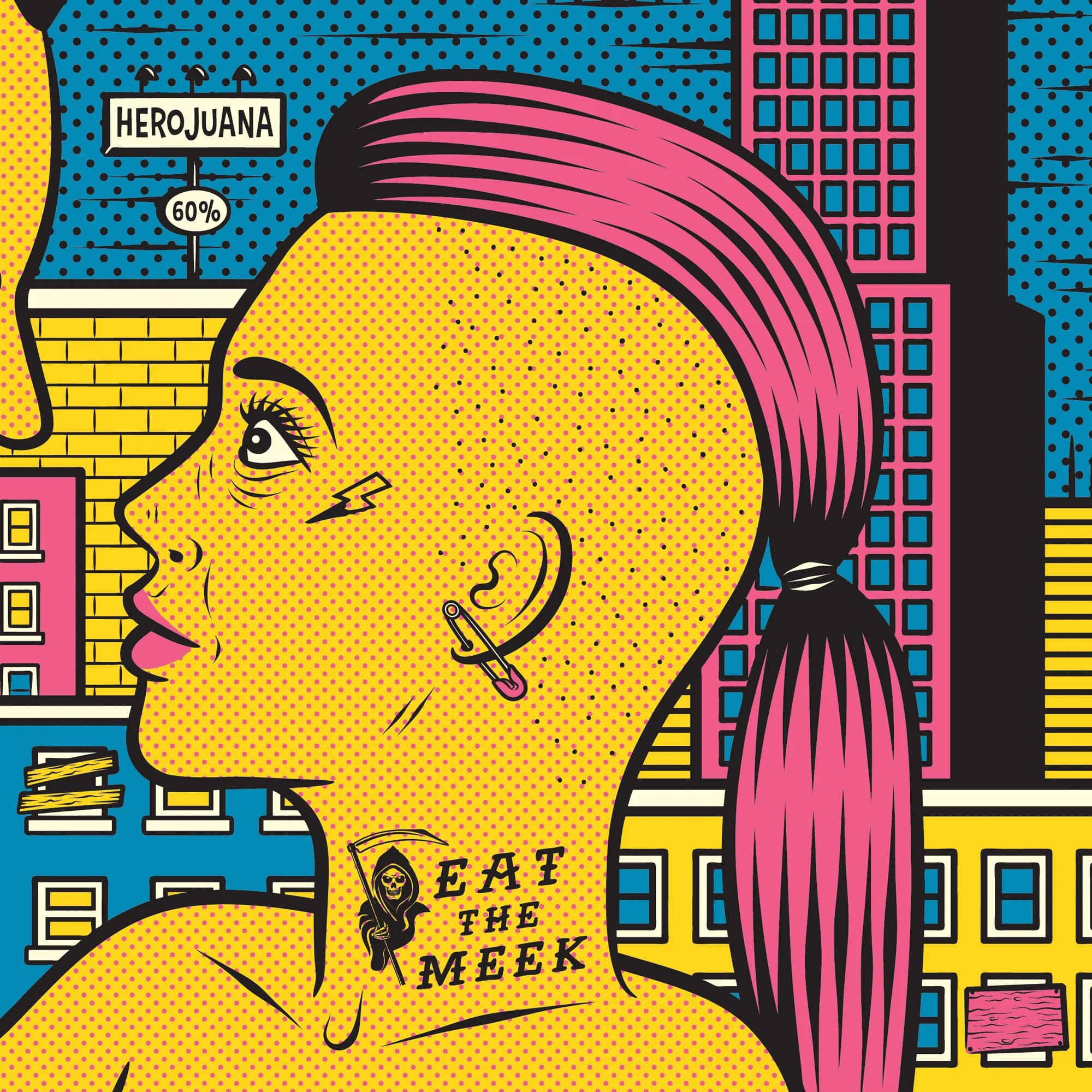
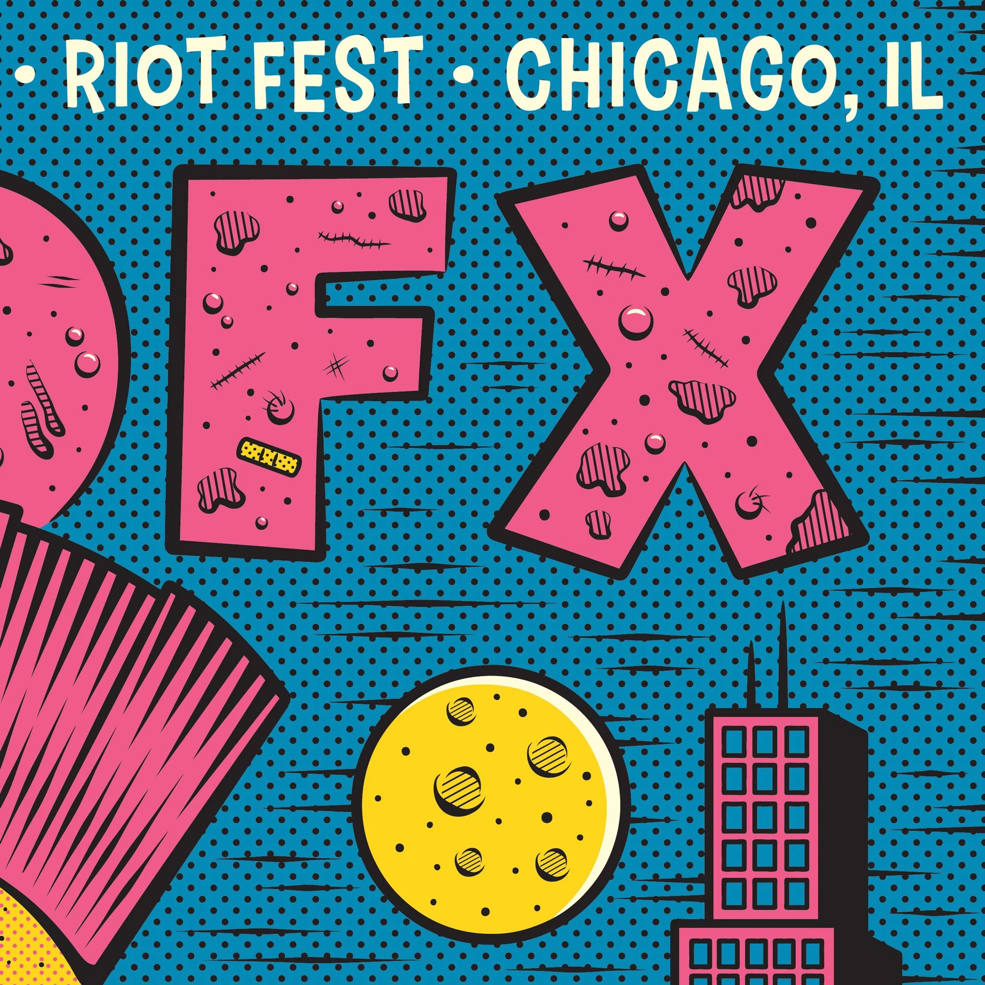
Client: NOFX • Iconic California Skate-Punk Pioneers
Project: 18x24 Screen printed Gig-Poster For Their Show At Riot Fest 2021
For legendary skate-punk outfit NOFX’s appearance at Riot Fest Chicago in 2021, Mike was commissioned to create an official gig poster that would capture the band's irreverent spirit through a nostalgic lens. The concept was born from a collision of genres, taking the drama and composition of classic 1950s romance comic panels and injecting it with pure punk rock energy. The illustration features a mohawked couple embracing under the moonlight, set against a gritty, pseudo-dystopian interpretation of the Chicago skyline. The aesthetic leans heavily into vintage print production nuances, utilizing prominent halftone patterns and a striking, limited CMYK-style color palette to create a piece that feels like a discovered artifact from a rebellious past.
To ensure a seamless transition to print, upon final artwork approval, Mike provided an expertly trapped color separation file, minimizing production hurdles and guaranteeing a high-quality final result from the screen-printer.
** CLICK / TAP A THUMBNAIL TO PULL UP FULL-SCREEN SLIDESHOW **
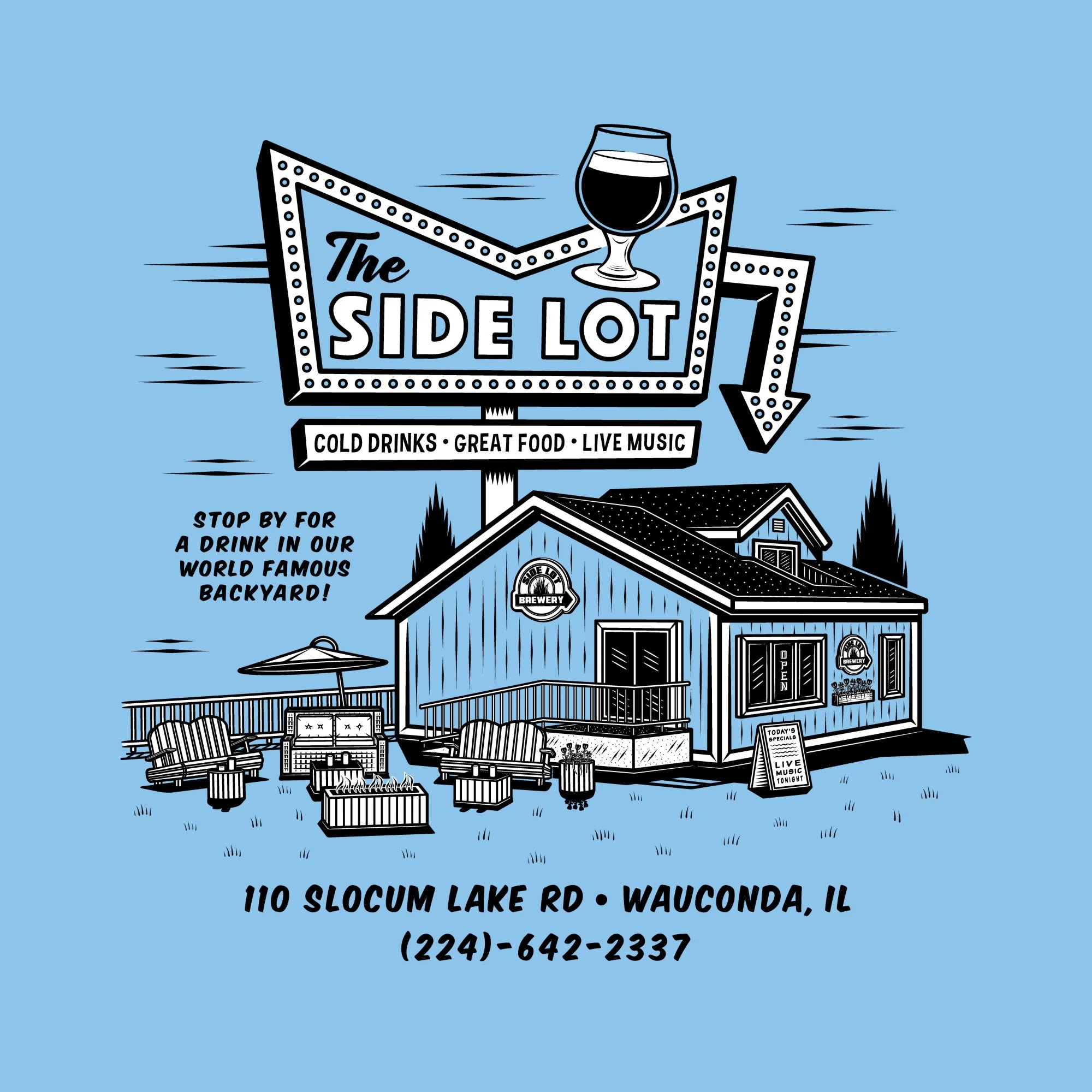
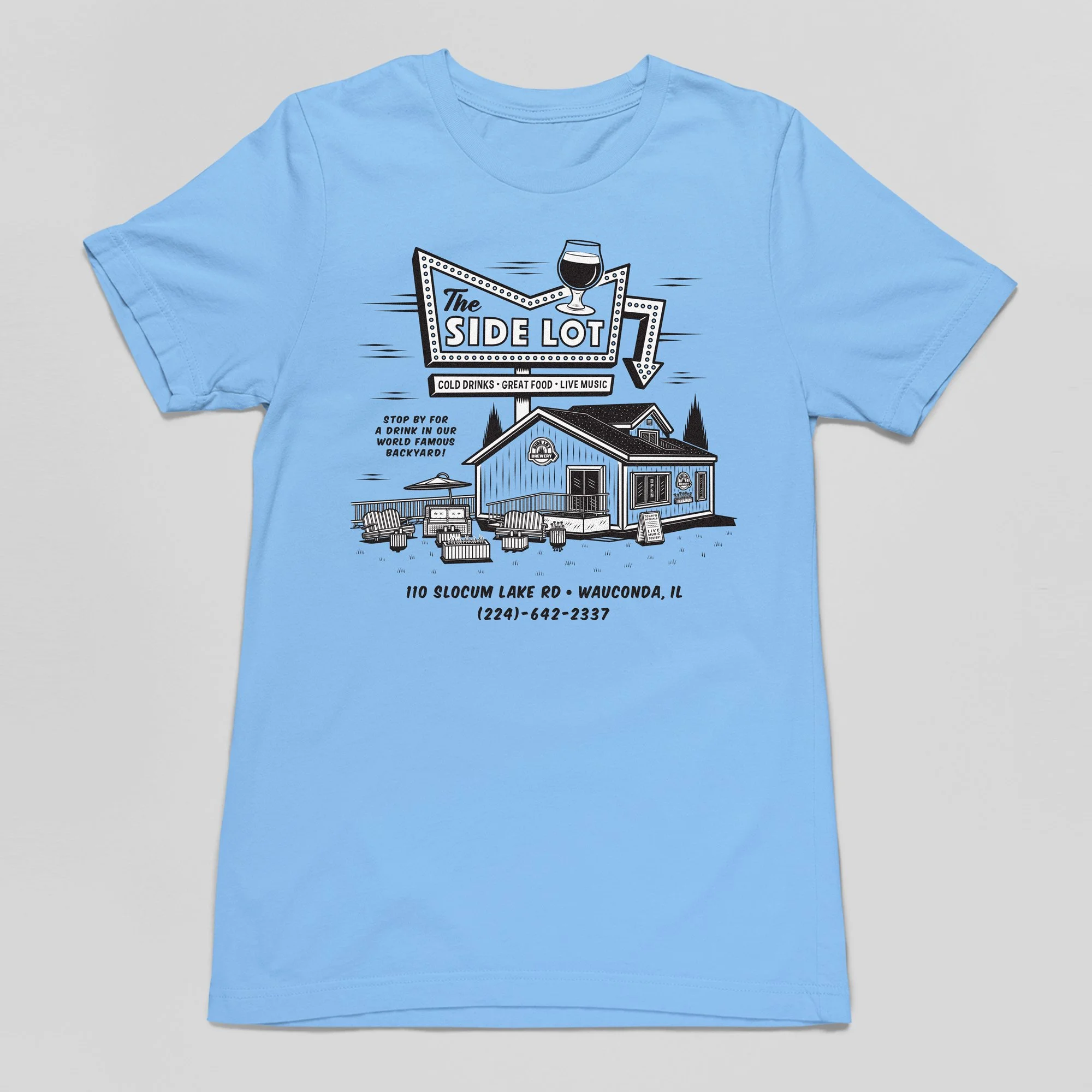
Client: Side Lot Brewery / The Side Lot • Wauconda, IL
Project: Summer Backyard T-Shirt Design
To celebrate The Side Lot’s iconic outdoor patio, Mike developed a t-shirt design that pays homage to Wauconda’s history as a mid-century resort destination. Drawing inspiration from vintage matchbooks, menus, and apparel, the illustration features a stylized interpretation of the restaurant’s exterior and its, "World Famous Backyard." The design balances high-contrast line work with a nostalgic aesthetic, capturing the relaxed, community-focused spirit of the space. To maintain a classic, "souvenir" feel, he utilized a minimal color palette optimized for a light blue garment, capturing a timeless aesthetic that feels less like a new release and more like a rediscovered piece of local history.
Upon completion, Mike delivered a finely crafted color-separation file, and a graphic placement / color guide for the screen printer, as well as several other graphic assets for online promotion of the shirt’s release.
** CLICK / TAP A THUMBNAIL TO PULL UP FULL-SCREEN SLIDESHOW **